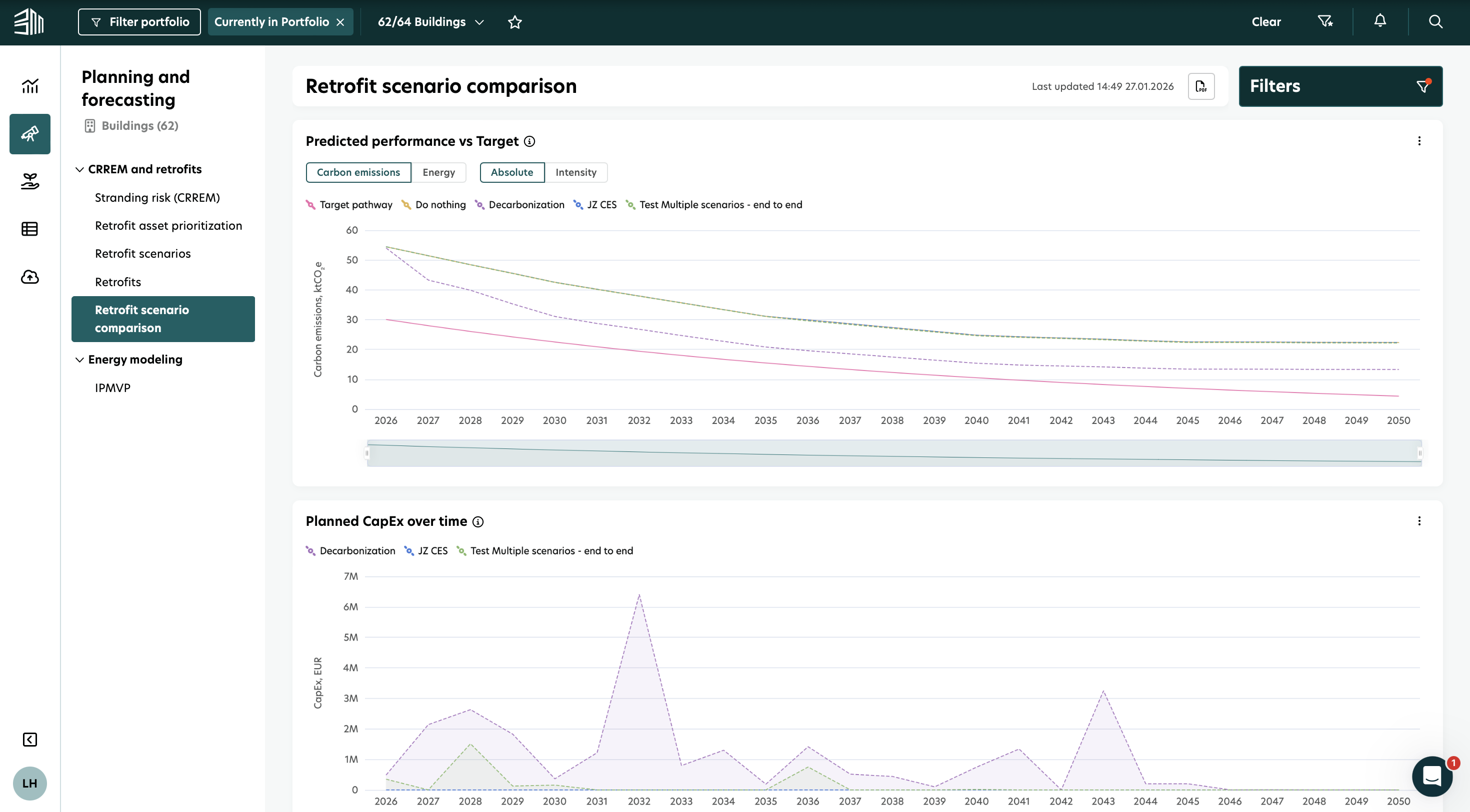
Retrofit scenario comparison
The Retrofit Scenario Comparison dashboard helps you understand how different retrofit scenarios affect the sustainability performance of your buildings or portfolio. It brings key sustainability KPIs into one clear view, so you can easily compare decarbonization outcomes. With this dashboard, you can track and compare:
Carbon emissions
Energy consumption
Projected carbon savings
Capital expenditure (CapEx)
The report allows you to compare multiple decarbonization strategies for individual buildings or entire portfolios. It shows how each scenario performs against CRREM or custom targets and helps you balance costs with emissions reductions, energy savings, and operational cost improvements.
Access the retrofit scenario comparison
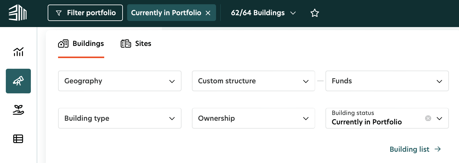
Select the Planning and Forecasting icon in the left menu.
Select Retrofit Scenario Comparison under CRREM and Retrofits.
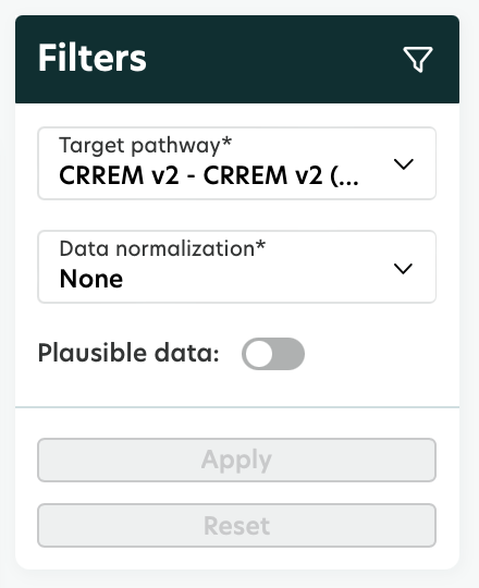
Filters
Filters help you control what data is shown in the report. You can find them in the top bar of the platform and in the Filter panel.
1. Portfolio Filter: The Portfolio filter lets you define the scope of the data in the report. You can select:
Regions, countries, or individual buildings (based on Geography or Custom structure)
Building attributes such as:
Type
Ownership
Status
Gross Floor Area (GFA)
Only the buildings that match your selection are included in the report.
2. Filter Panel: The data shown in the report depends on the filters and controls you select. These options help you define how the results are displayed, so you can tailor the insights to your analysis needs.
Filter in filter panel | Options | Description |
|---|---|---|
Target pathway | e.g. CRREM v1 1.5°C; CRREM v1 2°C; CRREM v2 1.5°C; CRREM v2 2°C; ‘Custom’ | Use this filter to define the target pathway and emission factors for the calculations. Choose between CRREM targets or custom pathways, depending on how you want to analyze your data. |
Data normalization and plausibility | None, Weather and vacancy | Use this control to adjust how values are shown by applying data normalization and plausibility rules. |
Visualizations and Insights
1. Predicted performance vs Target
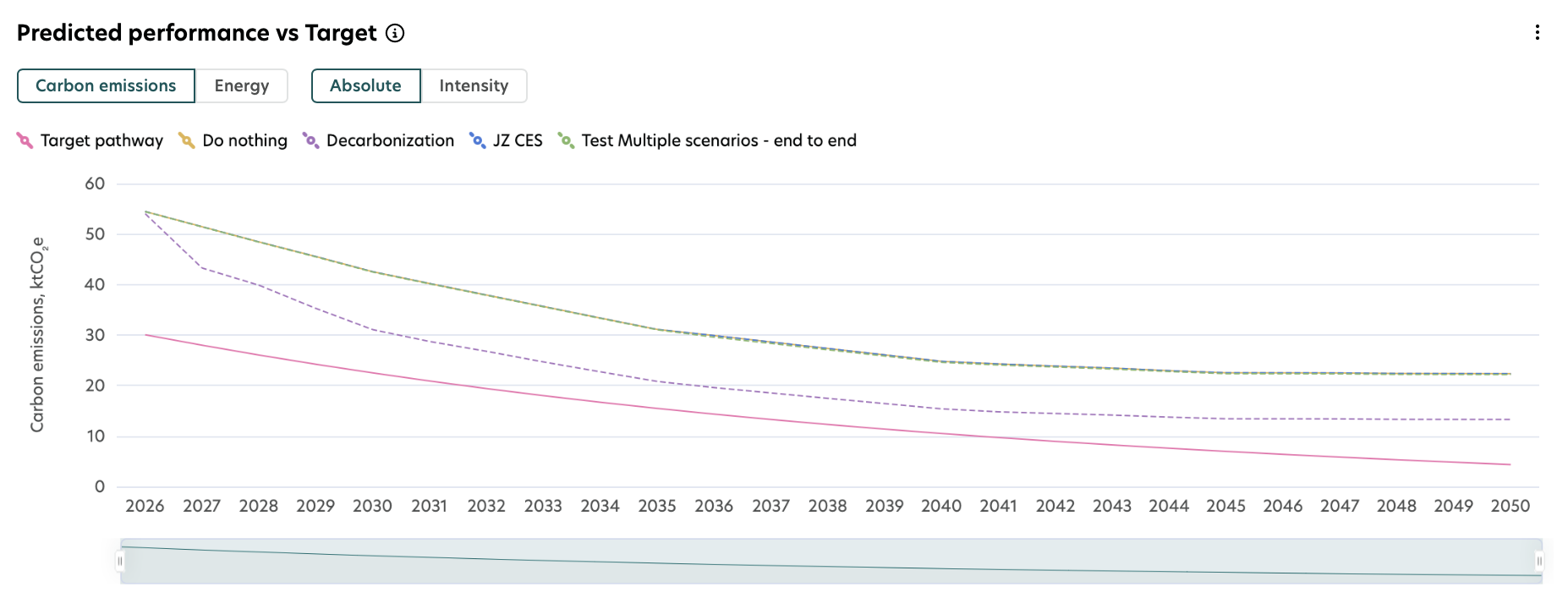
This chart compares the predicted operational carbon emissions or energy demand with the selected target pathway across different retrofit scenarios. Each line in the chart represents a retrofit scenario shown in the legend. With this chart, you can:
Switch between carbon emissions and energy demand.
Switch between absolute values and intensity values.
The Target pathway filter lets you select a CRREM pathway or define a custom target, depending on your reporting or analysis needs.
2. Planned CapEx over time
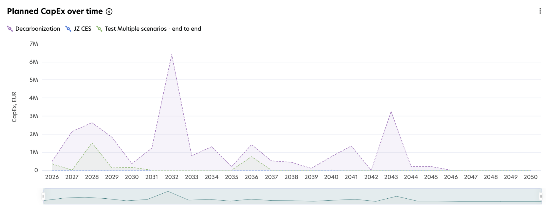
This chart shows how capital expenditures (CapEx) are distributed over time for each retrofit scenario. It helps you compare how investments are phased across the years, identify peak spending periods, and plan budgets more effectively.
3. Multi scenario comparison table
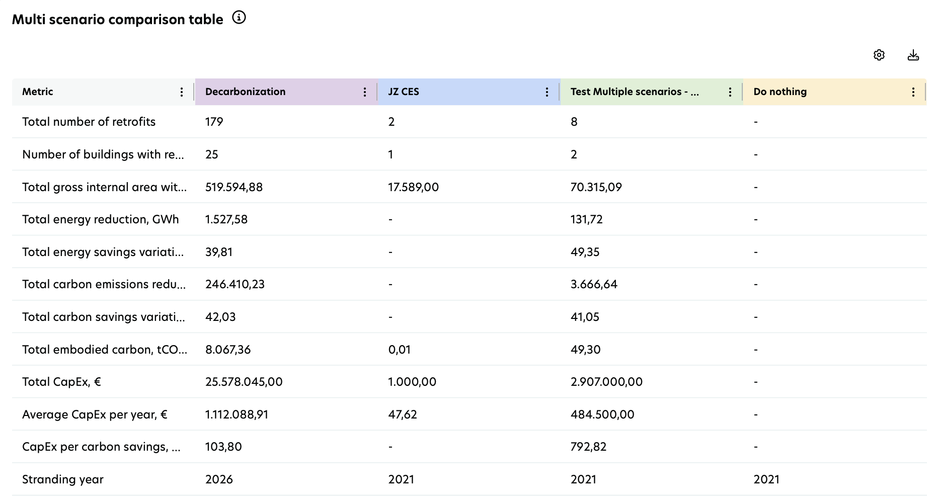
This table compares multiple retrofit scenarios across key building, environmental, and financial metrics. It helps you understand performance differences between scenarios, identify trade‑offs, and assess their overall impact. The values shown in the table reflect your selected filters. A brief explanation of each metric is provided below to help you interpret the results.
Scenario comparison metric | Description |
|---|---|
Total number of retrofits | Shows the number of planned retrofits included in each retrofit scenario. |
Number of buildings with retrofits | Shows the number of buildings with planned retrofits in each retrofit scenario. |
Total gross internal area with retrofits, m² | Shows the total gross internal area of buildings with planned retrofits. |
Total energy reduction, tCO2e | Shows the total cumulative energy savings from planned retrofits, from the year of implementation through 2050. |
Total energy savings variation, % | Shows the percentage difference in total energy consumption up to 2050 between the 'Do Nothing' scenario and the retrofit scenarios. |
Total carbon emissions savings | Shows the total cumulative carbon emissions savings from planned retrofits, from the year of implementation through 2050. |
Total carbon savings variation, % | Shows the percentage difference in total operational carbon emissions up to 2050 between the Do Nothing scenario and the retrofit scenarios. |
Total embodied carbon, tCO₂e | Shows the total embodied carbon associated with the planned retrofits. |
Total CapEx, € | Shows the total investment required for the planned retrofits. |
Average CapEx per year, € | Shows the average annual investment for planned retrofits, calculated by dividing total CapEx by the number of implementation years. |
CapEx per carbon savings, €/tCO₂e | Shows the average investment required per kilogram of CO₂e saved in each retrofit scenario. |
Stranding year | Shows the year in which operational carbon emissions exceed the selected decarbonization target pathway. |
NPV of total CapEx (coming soon) | Shows the present value of future investments for planned retrofits, calculated using a 4% annual discount rate. |
Total operational cost savings, € (coming soon) | Shows the total operational cost savings achieved through planned retrofits in each retrofit scenario, compared to the 'Do Nothing' scenario. |
NPV of total operational cost savings, € (coming soon) | Shows the net present value (NPV) of total operational cost savings from planned retrofits in each scenario, calculated using a 4% discount rate. |
Return on investment, % (coming soon) | Shows the percentage return on investment for retrofit measures in each scenario, based on operational cost savings compared to the required CapEx. |
Financial payback period, Years (coming soon) | Shows the number of years it takes for operational cost savings from a retrofit scenario to repay the initial investment. |
The Retrofit Scenario Comparison report displays results only for active scenarios and for retrofits with the statuses Draft, Proposal, Approved, or In Progress.
Results are not calculated for inactive scenarios or for retrofits with the statuses Completed, Rejected, Stopped, or Invalid.